The Balance Between Artificial Lighting and Ambient Light

The Balance Between Artificial Lighting and Ambient Light
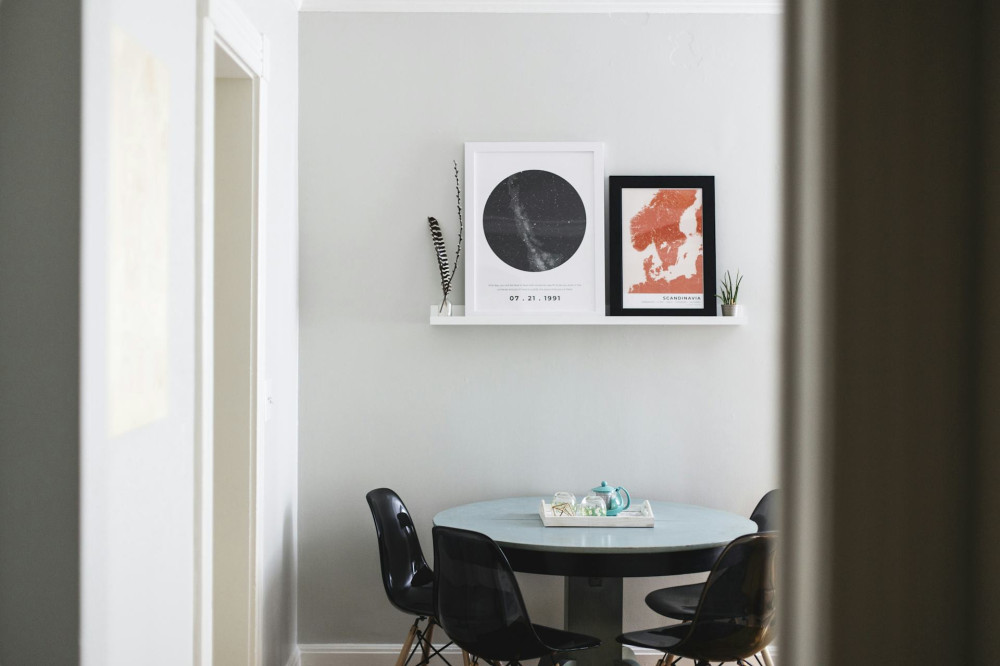
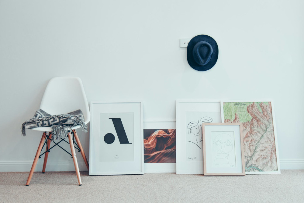
When we decorate our homes with art, we often focus on color, framing, and placement—but rarely on lighting. Yet light is what truly brings a piece to life. The right illumination can make colors glow, textures stand out, and the entire atmosphere of a room shift. But how do you find the balance between highlighting your artwork and maintaining a comfortable, cohesive light throughout the space?
Light as Part of the Experience
Lighting art isn’t just about making it visible—it’s about shaping the experience of it. A painting, sculpture, or photograph can look dramatically different depending on how it’s lit. A warm, soft light can create intimacy and calm, while a cooler, brighter light can emphasize contrast and detail.
Think about the mood you want to create. Should the piece be a quiet focal point in your living room, or a bold statement in your entryway? The answer will guide your lighting choices.
Direct or Indirect Lighting?
There are two main approaches to lighting art: direct and indirect. Direct lighting—such as from a spotlight—offers precision and brings out fine details, but it can also cause glare or harsh shadows. Indirect lighting, where light is reflected off walls or ceilings, produces a softer, more natural effect.
Often, the best solution is a combination of both. A directional spotlight can highlight the artwork, while ambient lighting ensures the room feels balanced and inviting. This way, the art stands out without feeling disconnected from its surroundings.
Læs også:

Color Temperature and Color Rendering
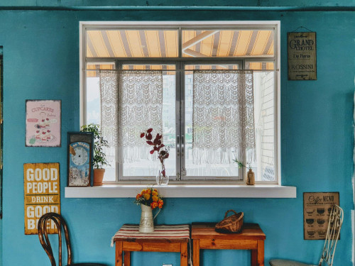
When choosing light sources, two factors are especially important: color temperature and color rendering index (CRI). Color temperature, measured in kelvins (K), determines whether light appears warm (yellow/orange) or cool (blue). Most artworks look best under neutral to slightly warm light—around 2700–3000 K—which resembles late-afternoon daylight.
The CRI measures how accurately a light source reveals colors compared to natural daylight. A high CRI (90 or above) ensures that hues appear true and vibrant—crucial for paintings and photographs where subtle color differences matter.
Preventing Damage and Glare
Artworks, especially those on paper or canvas, can be damaged by excessive light exposure, particularly ultraviolet (UV) radiation. Choose LED lighting, which emits minimal UV and heat. Avoid halogen bulbs and direct sunlight, both of which can fade pigments over time.
Position your lights to minimize glare. Glass frames and glossy surfaces can reflect light sources, disrupting the viewing experience. Angling the light slightly from above or the side often provides the best results.
Integrating with the Room’s Overall Lighting
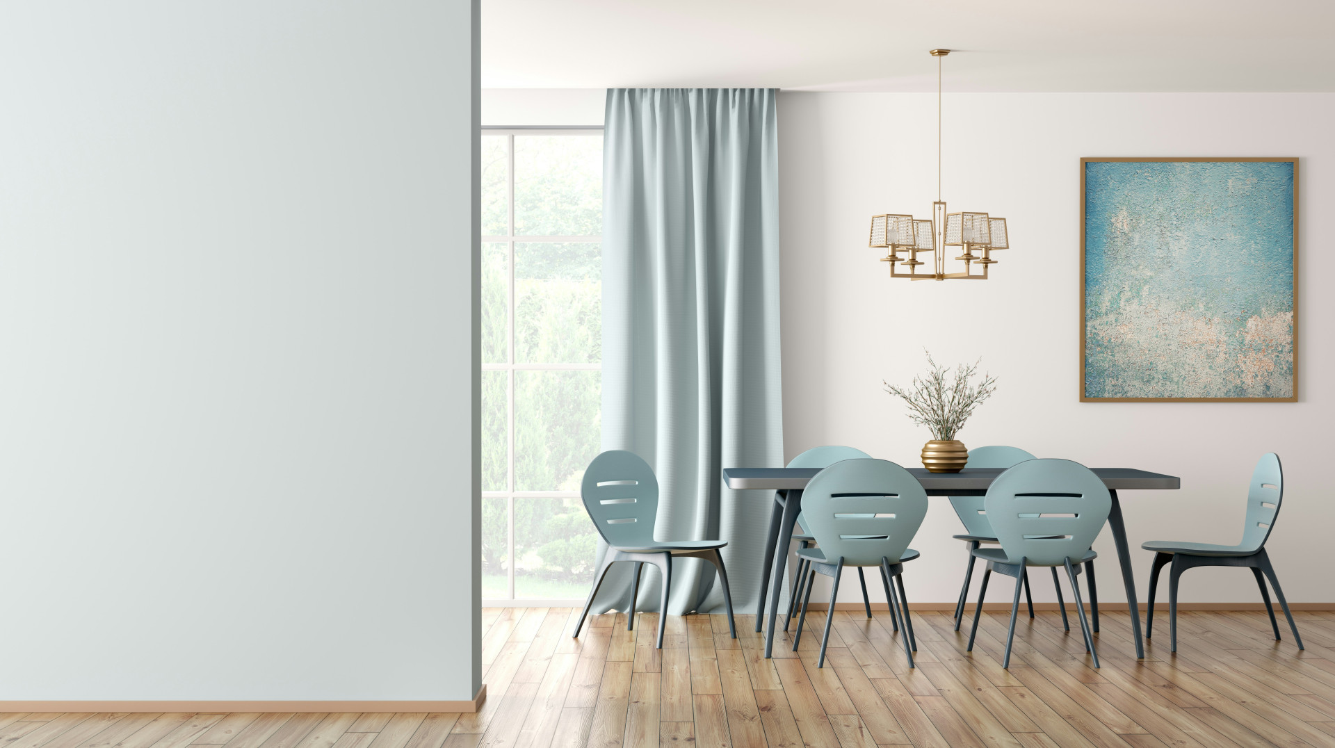
An artwork shouldn’t exist in isolation. The room’s general lighting—ceiling fixtures, floor lamps, and natural daylight—affects how the piece is perceived. If the rest of the room is too dim, the art lighting can feel harsh and disconnected. Too much background light, on the other hand, can make the artwork fade into the environment.
Think in layers: a base level of ambient light for comfort, and a focused accent light for the art. Dimmable fixtures are especially useful, allowing you to adjust brightness throughout the day or for different occasions.
Creating a Harmonious Whole
The best art lighting feels effortless. It enhances both the artwork and the room without drawing attention to itself. Observe how natural light changes throughout the day—perhaps morning sunlight flatters one piece, while evening requires a more controlled glow.
By experimenting with angles, brightness, and color temperature, you can find the perfect balance where art and environment complement each other. The goal isn’t to recreate a gallery, but to let your art live naturally within your home.
Læs også: